David Heo CS
How POP!NK brought to life the variant vision fueling David Heo’s ‘Pokémon’ prints
The Project
The art of David Heo erupts from the convergence of memory, myth and metamorphosis. His idiosyncratic, emotionally charged mixed-media assemblages — constructed from materials like crayon, colored pencil, oil stick, acrylic spray and paper cutouts — recontextualize traditions and tropes from across Western art history and Korean folklore, capturing the visceral intensity of modern life and interrogating Heo’s place within it.
“With collage, there’s a poetic transference that happens for me when combining all the cut sheets of painted paper. It becomes a process of literal stacking, filled with gestures and memories. All that mixed materiality and their individual textures can be in reference to how densely layered my identity is,” says the Korean-American artist, who was raised in rural Georgia and now resides in Chicago.
POP!NK Editions first worked with Heo on a limited-edition screenprint for ‘Smoke and Honey,’ his March 2020 solo exhibition at Chicago’s Vertical Gallery. “We’re big fans of David's work,” says POP!NK’s Curtis William Readel. “What attracted me was not only the imagery and the approach, but also the challenge of translating each of the different types of media through our process.”
When media and entertainment brand Complex Networks invited POP!NK to participate in the 2020 installment of its annual ComplexCon youth culture festival, Readel and fellow co-founders Zach Schrey and Steve Seeley approached Heo to create an exclusive print for release during the event. Heo pitched a project based on a recent collage celebrating Pokémon, the massively popular multimedia franchise created by Japanese videogame designer Satoshi Tajiri.
“During the COVID lockdown, David had gotten interested in Pokémon trading cards and collectibles, and he came in with that collector knowledge,” Readel explains. “He said ‘We have to do [the dragon-like character] Charizard — everybody's gonna go crazy.’ David's ‘1999 (Charizard)’ print sold out immediately, which started the process of doing three more Pokémon prints with him over the next two years.”
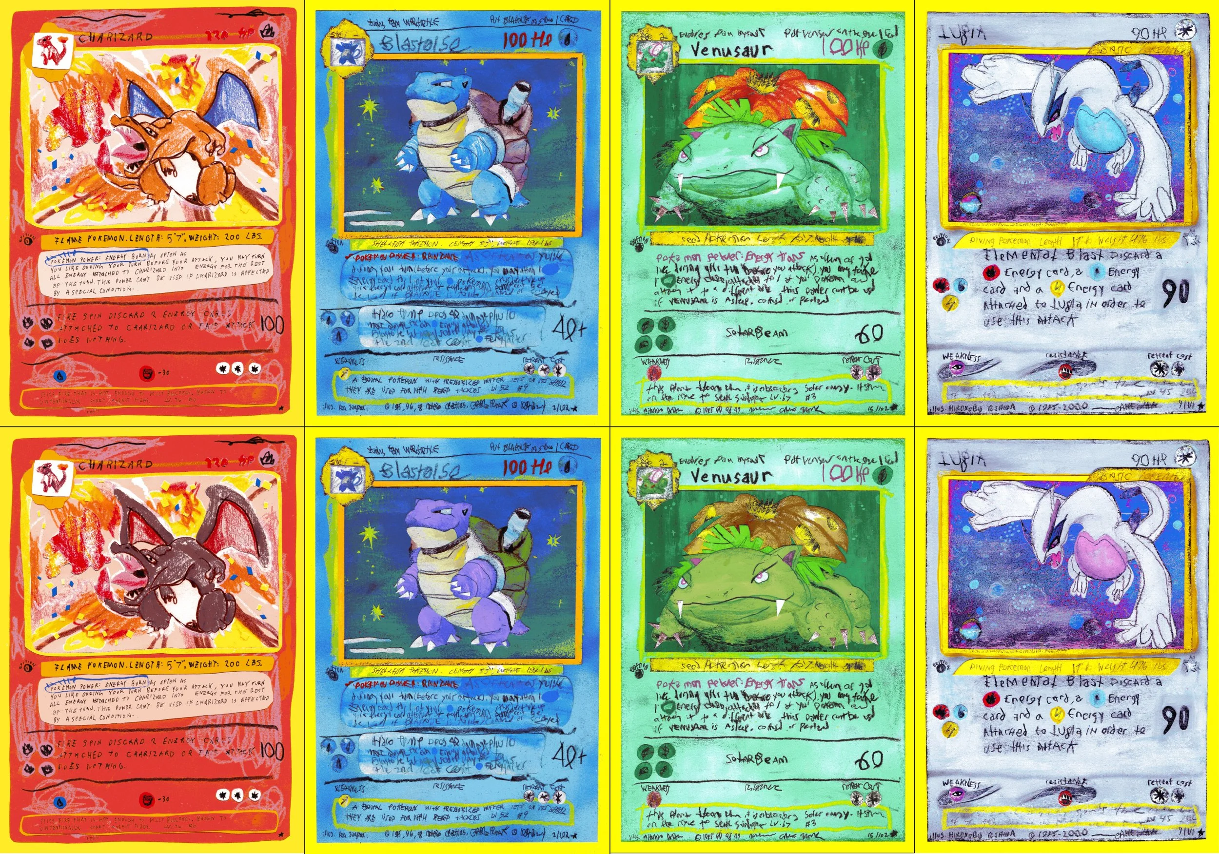
Digital mock-up of all four Pokémon prints and their “Shiny” variants.
The Process
Streamlining Heo’s Pokémon card-inspired collages into screenprints posed a series of technical challenges for POP!NK to solve. Replicating the unique textures and nuances of each medium within Heo’s original artwork was just the beginning; POP!NK also had to faithfully reproduce his fine linework and subtle shading.
Color matching presented its own difficulties. Screenprints are created one color at a time, with a new screen pulled for each layer of color applied. Keeping the Pokémon prints affordable for collectors meant limiting the number of screens used during production, while still employing enough colors to properly translate Heo’s vision.
POP!NK’s answer: Dither, a screenprinting technique that relies on patterns of tiny, solid dots (a.k.a. pixels) to simulate shades and gradients.
“Dither uses a combination of color overlays [multiple ink layers printed sequentially to create new colors, depth and effects] and transparent color overlays,” Readel explains. “First we sample the colors, then we figure out the print order. It’s not like a paint-by-number where we can say ‘It takes 20 colors total to do this. Now let's execute.’ We have to use our knowledge of the printing process and our understanding of the artist to figure out what’s most important. It’s about taking in the totality of what the client wants — the gestalt — and ensuring accuracy while keeping the project to a balanced, budget-conscious number of colors.”
POP!NK invited Heo to its Chicago studio to discuss his Charizard collage and determine which aspects and features were essential to the screenprinted version. After completing a mock-up, both sides agreed on an 11-layer screenprint using hand-mixed archival inks.
Heo and POP!NK also devised a plan to ensure their efforts resonated with the Pokémon collector community: variant screenprint editions.
Worldwide sales of Pokémon trading cards remain brisk, with production topping the 75 billion mark in March 2025 (enough to wrap around Earth end-to-end 165 times) — a fandom fueled by rare variant cards featuring alternate art, holographic images, etc.. “When Pokémon enthusiasts buy packs of cards, they’re looking for something shiny and holo,” Heo states. “We wanted to translate those same mechanics into our prints.”
He and POP!NK created a series of hyper-limited variants spotlighting so-called “shiny Pokémon” — i.e., alternate forms of the franchise’s eponymous fictional creatures, depicted via different color palettes.
“We wanted to mimic the ‘Gotta Catch ‘Em All’ frenzy around Pokémon,” Readel says. “By offering a variant edition of each character, as well as separate extremely limited editions of both regular and variant on foil holographic paper, we gave fans additional products to collect and trade.”
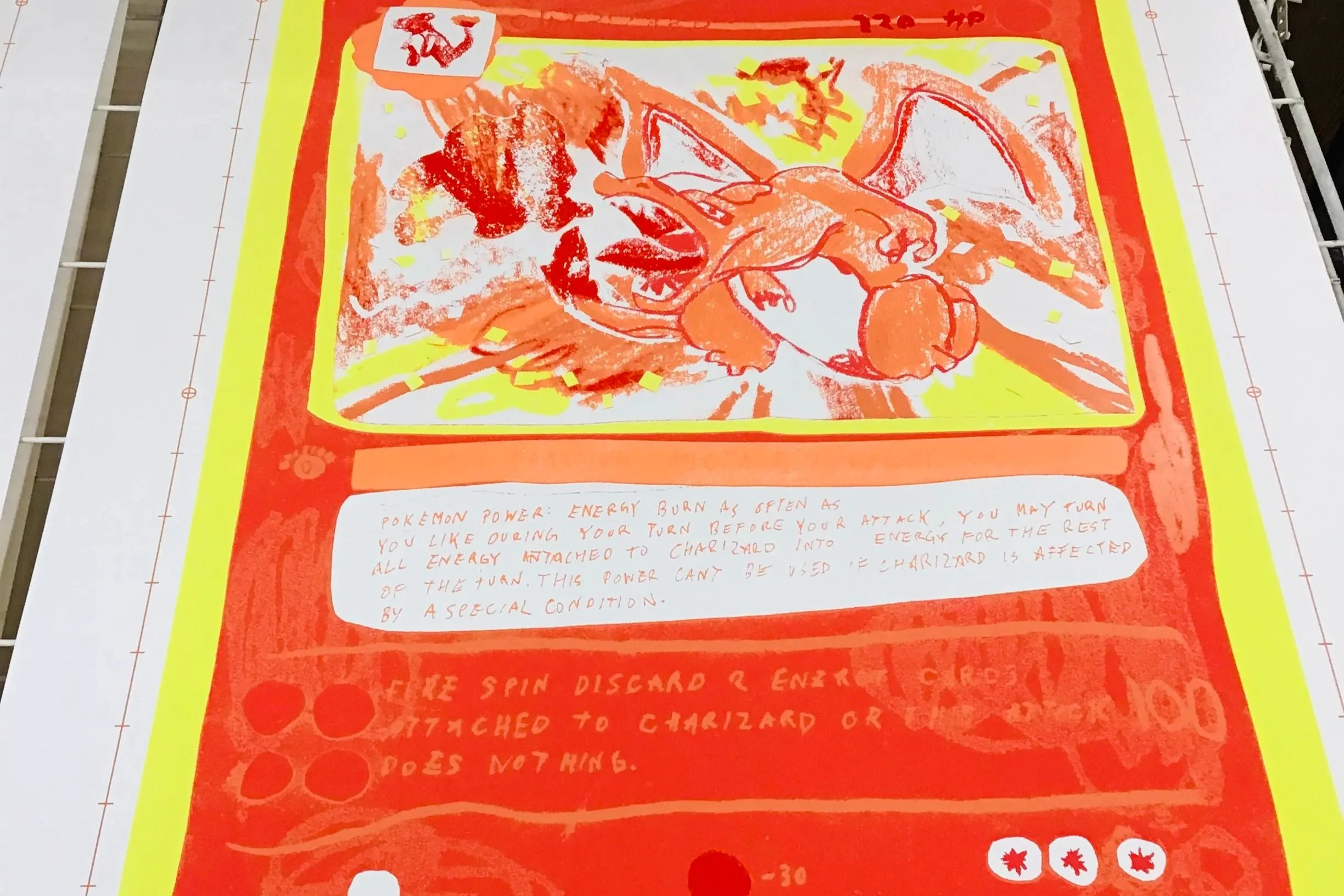
4 of 11 colors/layers printed
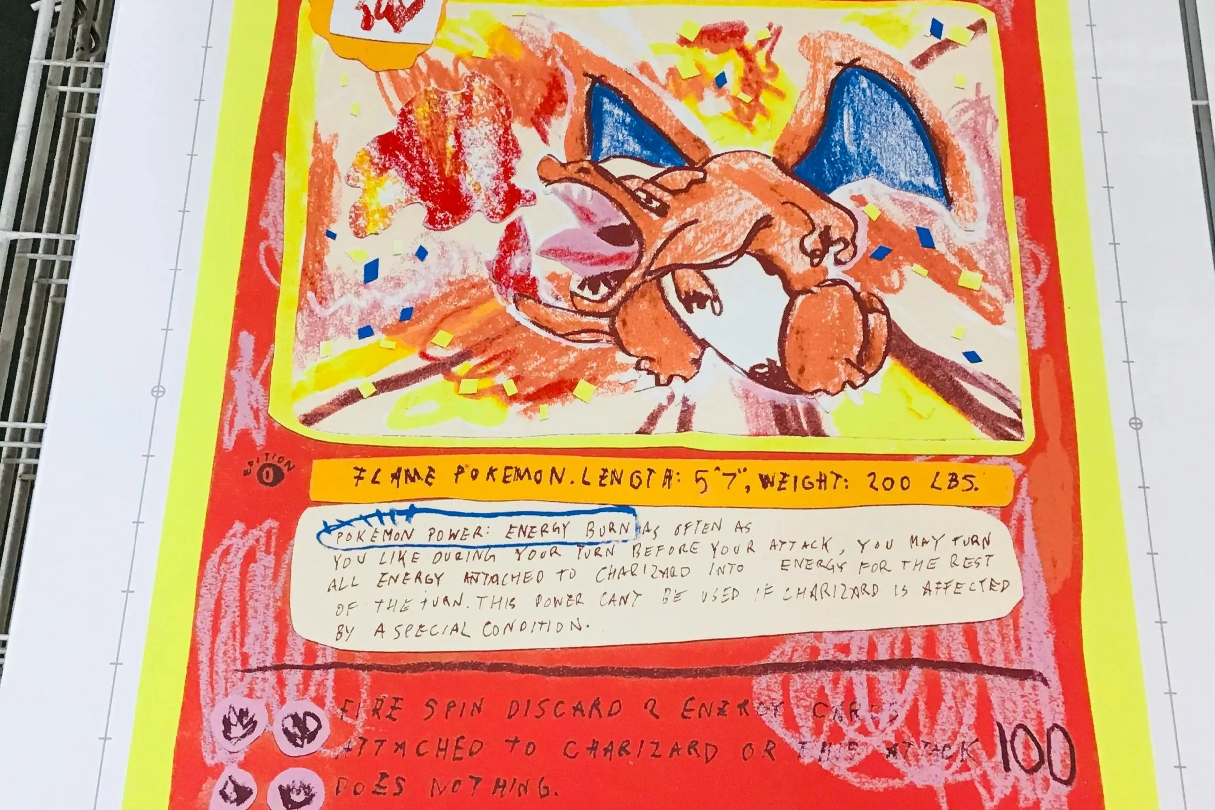
10 of 11 colors/layers printed
The Product
POP!NK hand-pulled 40 prints and 10 artist proofs of the standard edition of “1999 (Charizard),” along with 15 variants/five APs. The team also produced nine holo-foil prints and five artist proofs, as well as three variants/three APs, on Mirri Silver mirror rainbow holographic foil paper. POP!NK custom-mixed inks for each edition.
After “1999 (Charizard)” sold out at POP!NK’s webstore, Heo returned ten months later for the sequel, “Nostalgia (Blastoise).” The third Pokémon release, “Last But Not Least (Venusaur),” closed out 2021, and “2000 (Lugia)” wrapped up the series in early 2022. All four prints arrived among a phalanx of variant versions.
“Pokémon is the biggest collectible phenomenon since Beanie Babies,” Readel says. “When we approached this print, I knew nothing about all the different types of collectible trading cards, but I was interested in the graphics — their hyper-relevance in a world where everything is very in color. Through David’s new love of Pokémon, we learned what a collector thing it’s always been, and how much collectability is built into the system. Then we figured out how to integrate this core idea of variant colorways into our offerings throughout the series. That's a big reason why this series was an important milestone for us: we were unaware of the alignment between Pokémon’s collectability and the alternate print versions we were already doing with artists, and creating tiers within an edition.”
Readel credits the impact of the Pokémon series to collaborating directly with Heo at every stage of the creative process.
“We did something really special for the ComplexCon audience, and in finding success with the initial project, we were able to scale up to four different prints and recreate the passion around Pokémon in a different arena,” he says. “Everything coalesced.”
POP!NK’s technical mastery played a decisive role, Heo adds.
“They did a really great job with the print itself. If the print wasn’t so good, the idea wouldn’t work,” he says. “I always tell my friends who are painters ‘If you ever want to get a screenprint ready, you should talk to these guys.’”