Dr. Woo CS
How POP!NK threaded the needle for tattoo art titan Dr. Woo and Boston’s ICA
The Project
Hollywood’s biggest stars line up for an appointment with Dr. Woo. The tattoo artist’s intricate, single-needle designs are de rigueur among Tinseltown’s elite, adorning clients including Miley Cyrus, Drake, Justin Bieber and Zoë Kravitz.
The Los Angeles native, born Brian Woo, began his career under the tutelage of Shamrock Social Club founder Mark Mahoney, hailed as the godfather of black-and-grey tattooing — i.e., mixing black ink with distilled water to create a range of tones in the skin. Woo’s exquisite linework and hyper-realistic design aesthetic fueled intense demand for his services, and in late 2016 he launched his own private studio HIDEAWAY at Suite X, secreted inside the iconic Hollywood Roosevelt Hotel.
"I developed my style by trial and error," Woo says. "It wasn’t a very specific intention to do this. I tattooed in many different styles and figured out that this is what I was actually passionate about. Over the years it kind of evolved. Never something that was predetermined. I worked for a long time with my head down, and when I looked up, this is what it was."
Collaborations with brands like Rimowa, Porsche, Converse and Persol boosted Woo’s profile beyond the Hollywood hills, and in September 2022, he unveiled a site-specific video installation for Boston’s Institute of Contemporary Art. The ICA experience, co-designed by creative agency ICNCLST, included a special apparel capsule as well as an exclusive screenprint produced by Chicago’s POP!NK Editions.
“We’ve worked with [pioneering graffiti artist] Futura, who’s also represented by ICNCLST, and our contact there reached out about Dr. Woo,” explains POP!NK’s Curtis William Readel. “We literally had only a couple days to execute this project. Luckily for us, it was only one color, and because [fellow POP!NK co-founder Zach Schrey] is grounded in tattoo culture and knew all about Dr. Woo’s work, we could focus on the questions that needed to be asked and problem-solve them quickly.”
The Process
Screenprints are created one color at a time, with a new screen pulled for each layer of color applied. With just one layer to print (black, mirroring Dr. Woo’s tattoo work), POP!NK was able to sidestep many of the common challenges of its craft, like color matching, in addition to minimizing the time and physical labor required to produce each print.
There were still hurdles to clear, however — first and foremost, dot gain (a.k.a. tonal value increase), a phenomenon whereby printed ink dots appear larger due to variables like ink properties, paper absorption and press pressure, resulting in a final image that’s darker or muddier than intended.
“Dr. Woo’s linework is intrinsically detailed, and tiny details are hard to maintain in screenprinting,” Readel says. “To ensure that nothing gets lost, you have to figure out how large the dot gain is versus what you intentionally want to do, meaning you have to find the right screen mesh.”
Mesh count, the number of mesh openings per square inch of screen, is essential to controlling print thickness. A higher mesh number results in a finer pattern, while a lower mesh number indicates fewer openings. POP!NK ran a series of mesh tests during pre-production, and Dr. Woo selected the result he liked best.
Viscosity, a measure of how thick or thin an ink is, also played a decisive role. Viscosity is determined by how fast or slow ink flows when pressure is applied; inks with higher viscosity are thicker and flow more slowly, while inks with lower viscosity are thinner and flow more quickly.
POP!NK custom-mixed the black ink for the Dr. Woo x ICA print. “When we pull prints by hand, we want our ink to be not too thick, but also not too thin — spreadable, like peanut butter on a warm day,” Readel explains.
While POP!NK prefers to work one-on-one with artists, the team streamlined its creative process to meet the project’s tight turnaround.
“Our job is to try to understand what the client infers or means and or wants, without continually going back and forth,” Readel says. “When people come to POP, yes, they know what they want, but they are also looking to our expertise to guide them through the possibilities, depending on what their variables are. The great thing about this project is the technical simplicity of what we were hired to do: produce a one-color print, and maintain detailed linework and crisp edges. It was just a matter of mocking it up and sending that to the client for approval.”
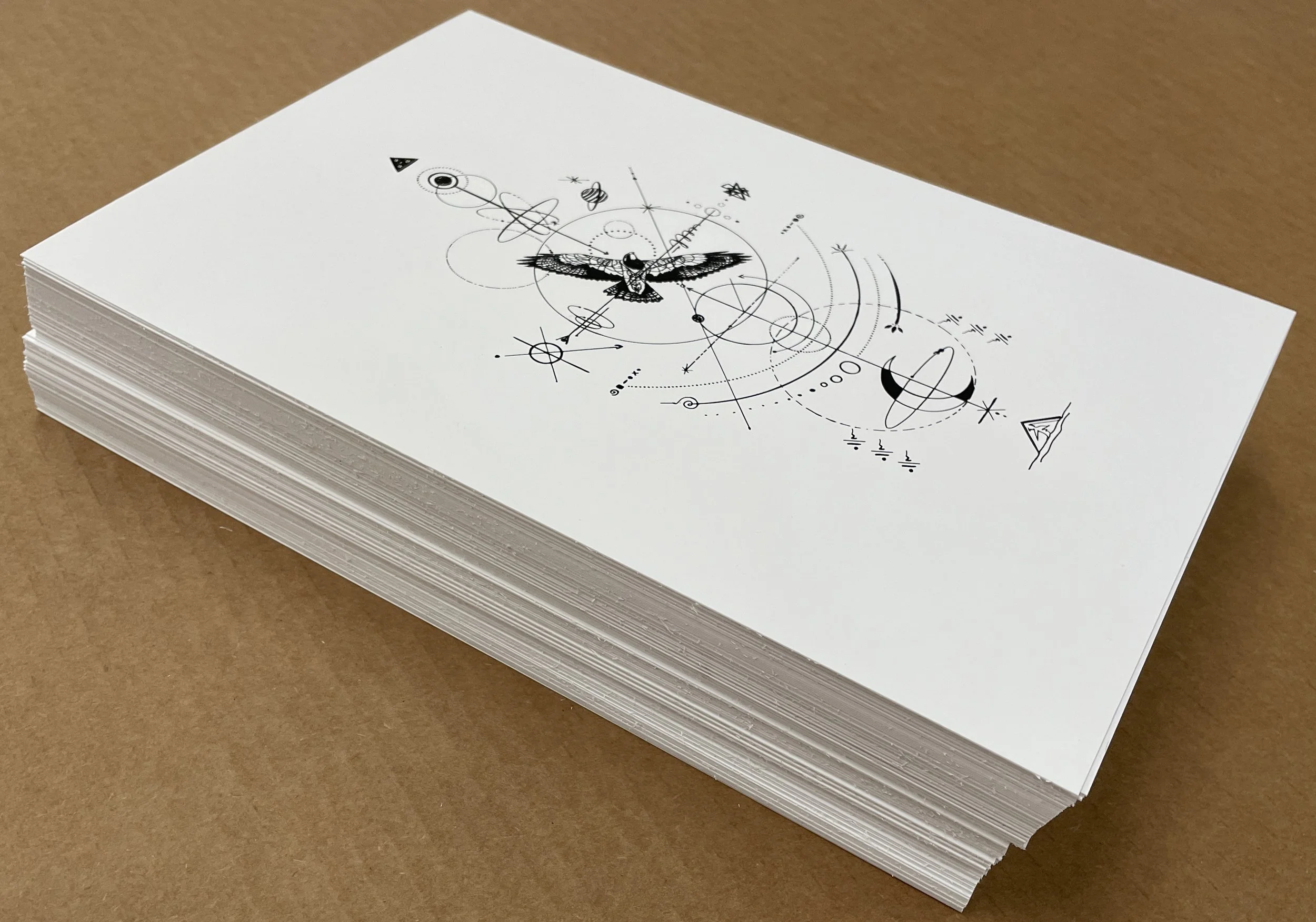
The Product
POP!NK hand-pulled 100 copies (plus 10 artist proofs) on eight-by-12-inch Mohawk Superfine UltraWhite 160 cover, each signed and numbered by Dr. Woo.
“Tattooists do small flash artwork, and the smaller size of this print is very much aligned with that,” Readel says. “It's also a good size for collectors, because it could be sandwiched between pieces of cardboard. Nobody visiting the ICA needed to bring a tube with them to get their print home safely.”
Dr. Woo was so pleased with the ICA print that he commissioned POP!NK to produce screenprinted gift cards for a subsequent event.
“We're technical specialists. It's no different than hiring an architect — you wouldn't want to hire just anybody. You want to make sure they're aligned with what your needs are,” Readel says. “Our clients may not know about viscosity or dot gain, but that doesn't mean we aren't thinking about these things. It’s what we're hired to do, and it’s how we deliver the best representation of the artist's work.”