Karl Wirsum CS
How Chicago art icon Karl Wirsum brought out the best in POP!NK
The Project
Karl Wirsum’s dynamic, distorted figures loom large over the history of Chicago art. The native South Sider, a 1961 graduate of the School of the Art Institute of Chicago (SAIC), rose to international prominence as one of six members of the sardonic and subversive Hairy Who, which between 1966 and 1969 mounted a series of landmark group exhibitions renowned for their emphasis on boldly exaggerated colors, forms and features.
“Wirsum belonged to a generation of artists that swam against the current of Abstract Expressionism and Minimalism. They invented a vital new kind of figuration that maintained a lively dialogue with modernism, popular culture and the viewer,” The New York Times’ Roberta Smith writes. “Wirsum’s achievement rested on his highly original synthesis of multiple sources — high and low, ancient and modern, East and West — and his fusion of organic and geometric forms. His figures almost inevitably combine a kinetic exuberance with something more sinister. Their masklike faces grin and grimace.”
Following a three-year teaching stint at California’s Sacramento State College, Wirsum returned to the Windy City in 1974 to teach at SAIC; that same year, he also headlined his first solo exhibition at Chicago’s Phyllis Kind Gallery, where he remained a fixture for two decades. The University of Illinois’ Krannert Art Museum presented Wirsum’s first career retrospective in 1991, and in late 2018, the Art Institute of Chicago unveiled Hairy Who? 1966-69, the first-ever major survey dedicated expressly to the sextet’s innovations and influence.
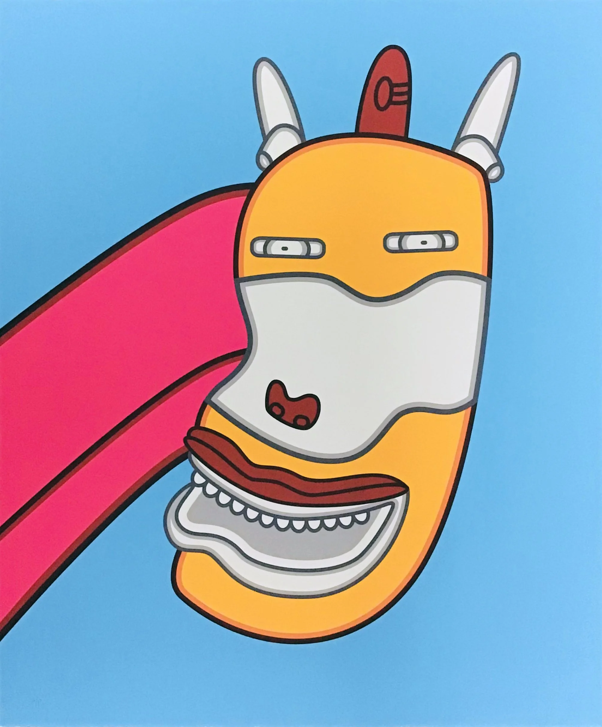
POP!NK Editions was deeply honored to collaborate with Wirsum on a number of limited-edition screenprints, culminating in 2020’s “The Gift Horse’s Mouth,” a project undertaken in support of New York City-based bookstore, artist organization and arts space Printed Matter and its fellow nonprofit New Art Dealers Alliance (NADA).
“Printed Matter reached out to the Wirsums about doing a fundraiser, and Lorri [Gunn, Wirsum’s wife] told them POP!NK was the exclusive printer for all of Karl’s prints,” recalls POP!NK co-founder Curtis William Readel. “We’d already worked with Printed Matter on a print for [Hairy Who artist] Suellen Rocca, so there was no trepidation. It all happened super organically.”
Completed 9-color/layer print
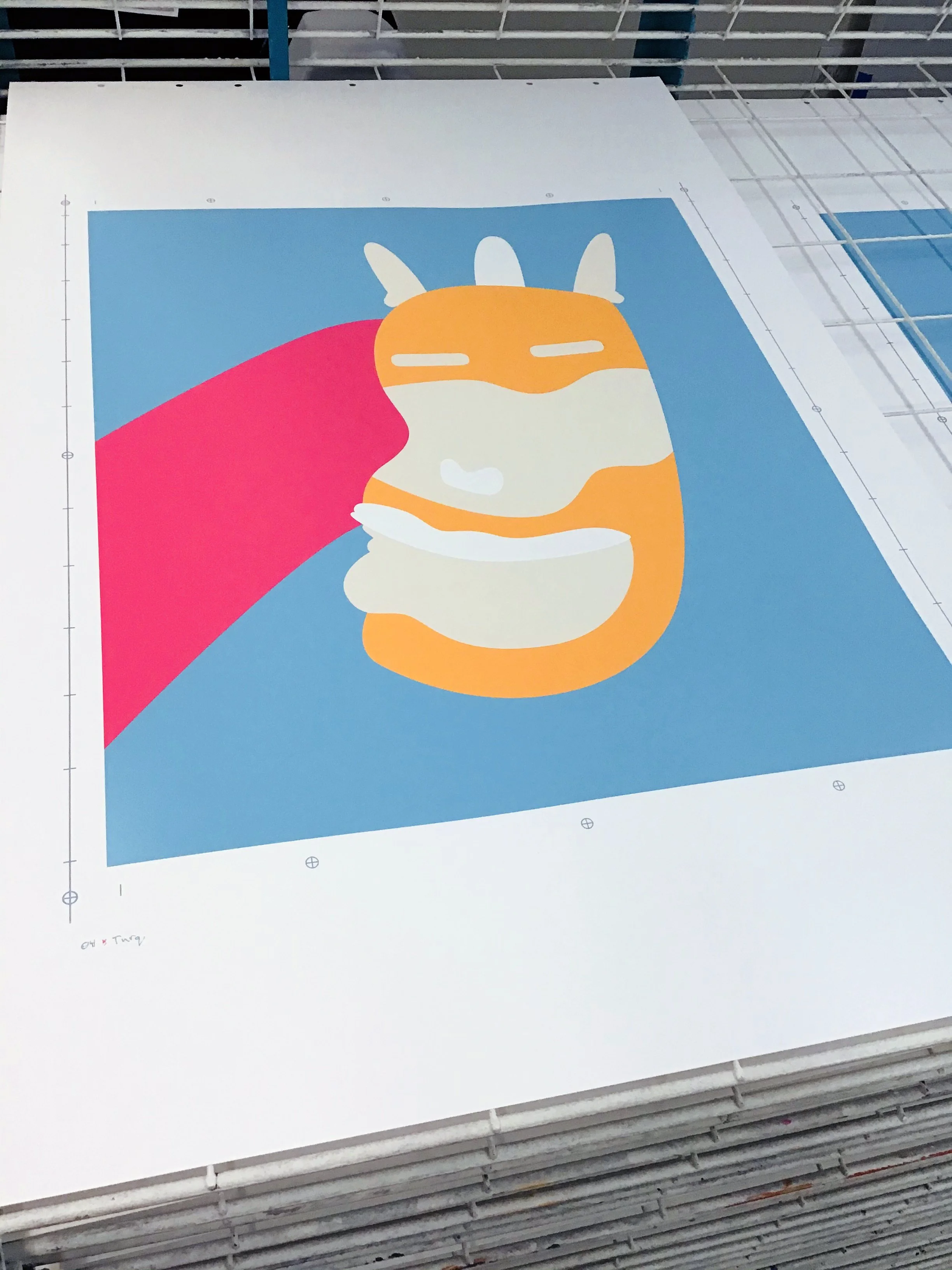
4 of 9 colors/layers printed
The Process
Screenprints are created one color at a time, with a new screen for each layer of color applied. Translating Wirsum’s idiosyncratic color palette tested POP!NK’s printmaking mettle.
“Karl's drawings at that time were done with crayons and colored pencils, and his vision for ‘The Gift Horse’s Mouth’ included very vibrant, saturated color flats [solid, uniform blocks of color without gradients, shading or complex textures], which is challenging to reproduce via water-based screenprinting,” Readel explains. “We had to step into his mind — into his process — and then lend our expertise to make sense of things.”
POP!NK’s solution: Traps, a pre-press technique that slightly overlaps adjacent colors to ensure seamless transitions. But traps present their own set of problems.
“Overlapping exposes the inherent transparency of the inks, which means you're able to see the color underneath. There are certain colors you can add to make inks more opaque, but that makes them more chalky and less vibrant,” Readel says. “The workaround was finding a happy medium between colors that weren’t too transparent, but still vibrant — colors that could hide the traps.”
The POP!NK team made multiple visits to the Wirsums’ Chicago residence to share test prints, renewing a relationship that began years earlier with a series of high-end prints commissioned by Detroit-based gallery Louis Buhl & Co. Wirsum ultimately signed off on a nine-layer interpretation of “The Gift Horse’s Mouth” printed with hand-mixed archival inks.
“Working with high-end artists means making sure each project meets with their satisfaction, regardless of whatever problems it creates,” Readel says. “At no point did we tell Karl ‘This is going to be tough.’ Those are internal problems. All that matters is making the artist happy with the result. That's why you hire us.”
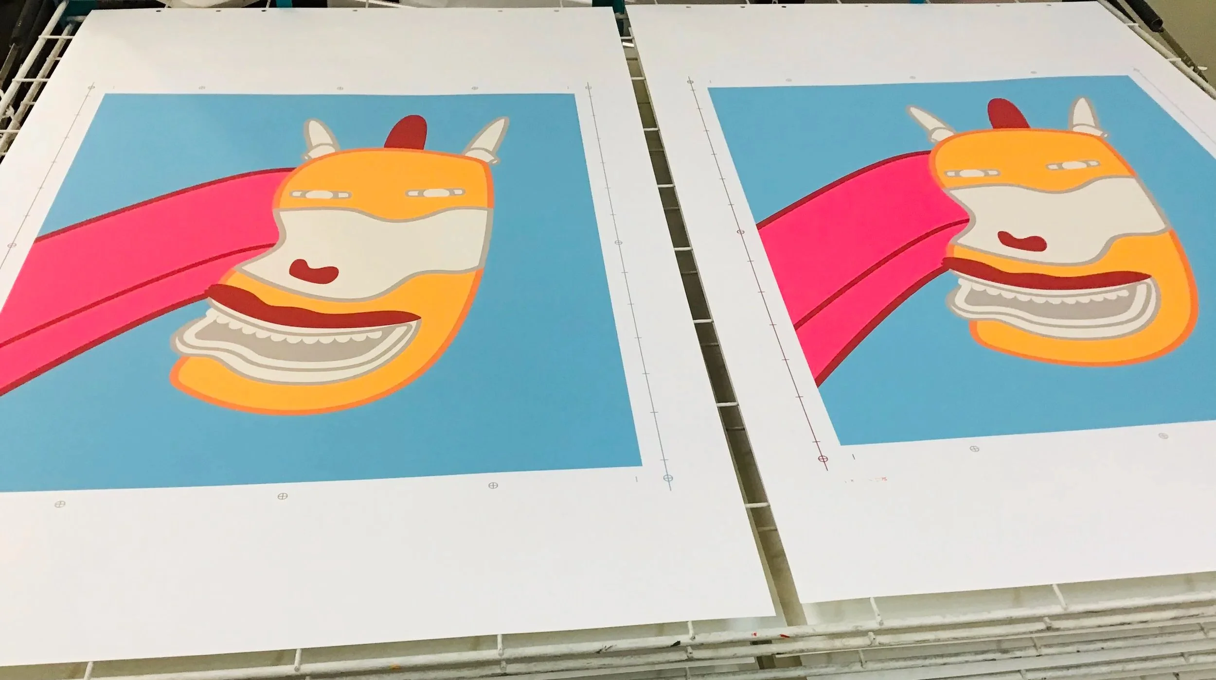
7 of 9 colors/layers printed
The Product
POP!NK hand-pulled 100 copies (plus 16 artist proofs) of “The Gift Horse’s Mouth” on 20 by 24-inch Mohawk Superfine UltraWhite 160 cover paper, differentiating the project from the 22 by 30-inch Wirsum prints the company produced for Louis Buhl & Co.
When declining health prevented Wirsum from personally signing copies of “The Gift Horse’s Mouth,” POP!NK created an embossed chop mark bearing the artist’s signature. “The chop was approved by Karl, Lorri and their son Zack,” Readel says. “It solved the problem at hand, while addressing any issues we might face in the future.”
“The Gift Horse’s Mouth” was the final project POP!NK completed for Wirsum prior to the artist’s death in May 2021. Readel remains in awe of the man and his accomplishments.
“Karl was special,” he says. “Growing up in Iowa, I looked at Karl as one of the few Midwest artists that made it big, and did it his own way. I never dreamed I’d get the chance to actually work with him, but somehow it happened. I will always cherish those moments.”